Visualizing rates with icons using the ggimage package.
The need to illustrate school corporation transfer rates for a recent project provided an opportunity to use use icons, color and shape to convey meaning. The resulting charts, used in the webpage’s first scrolling sequence and for the choropleth map popups, enabled consistent comparisons across the state’s 290 school corporations.
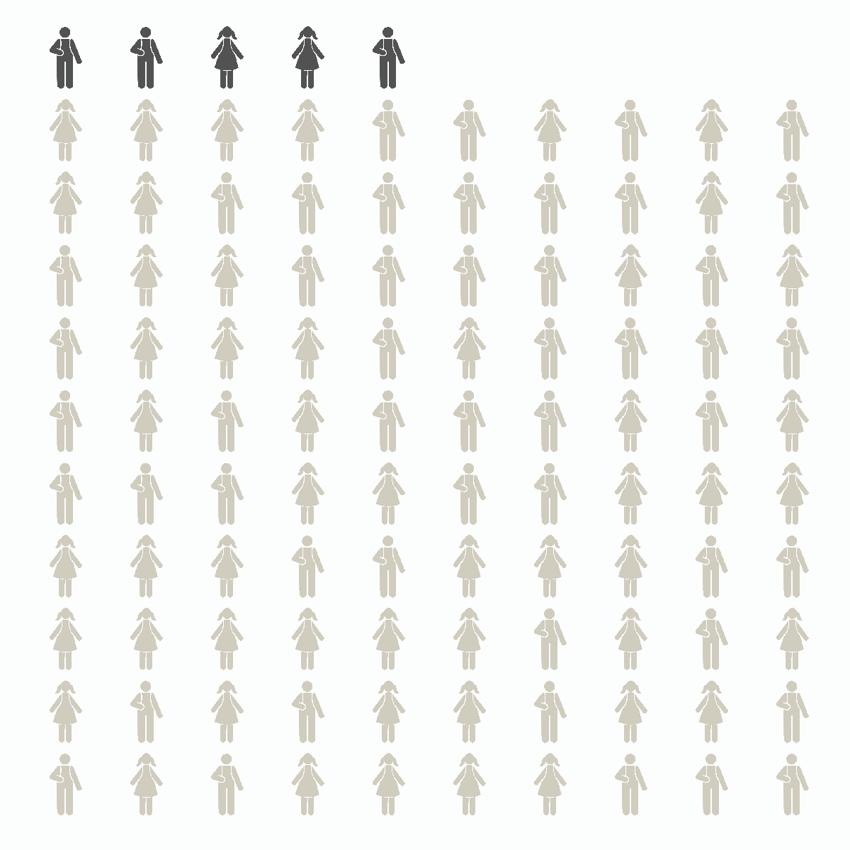
The idea was to create a grid of 100 boy and girl student icons and programmatically substitute different versions to represent incoming and outgoing transfers. The execution was subtly different for the map and the webpage explainer but the premise was similar. For school corporations with a negative transfer rate, cutout icons would replace regular icons to connote the outgoing transfer students’ absence. For school corporations with a positive transfer rate, additional icons of a different color are added to the base grid to represent the incoming students.
For this post, I’ll walk through how the webpage explainer charts were created.
The icons came from Adobe Stock, were adjusted in Photoshop and saved as png files, preserving the transparent background and the ability to adjust the fill color within ggplot.
In R, the first step after loading the necessary R libraries (ggimage and tidyverse) is to set the colors and import the icons. They are the only external elements needed to re-create this example and can be pulled directly from the project’s github repo. Both pairs of images, the regular versions and the cutouts, are assigned their own vector so they can be sampled randomly.
library(tidyverse)
library(ggimage)

# set colors
lgst <-   '#d0ccbe'  # legal settlement
inc  <-   '#525252'  # incoming transfers
bg_c <-   "#fcfdfd"  # background color
pub  <-   '#d95f02'  # public school
chr  <-   '#1b9e77'  # charter school
pr   <-   '#7570b3'  # Choice Scholarship

# values for scale_manual
vals <- c(
  '#d0ccbe' = '#d0ccbe',
  '#d95f02' = '#d95f02',
  '#1b9e77' = '#1b9e77',
  '#7570b3' = '#7570b3',
  '#525252' = '#525252',
  "#fcfdfd" = "#fcfdfd")

# set up png images
# girl icon, full fill
gt <- "https://raw.githubusercontent.com/tedschurter/in-ed-transfers/main/icons/girl_plain.png"
# girl icon, cut out
gcu <- "https://raw.githubusercontent.com/tedschurter/in-ed-transfers/main/icons/girl_cu.png"
# boy icon full fill
bt <- "https://raw.githubusercontent.com/tedschurter/in-ed-transfers/main/icons/boy_plain.png"
# boy icon, cut out
bcu <-  "https://raw.githubusercontent.com/tedschurter/in-ed-transfers/main/icons/boy_cu.png"

# create a vector of students
student <- c(gt, bt)

# create a vector of students for outgoing transfers using cutout icons
out_st <- c(gcu, bcu)
The next step is to create a dataframe that can be used as a foundation when looping through the school corporations to create the net rate charts, or as a baseline for the explainer graphics.
# create dataframe representing grid of 10 x 10 student icons of randomly assigned genders

df <- data.frame(
  row = seq(1:100), # add row number to filter icons when sampling replacement rows
  x = rep(seq(1, 10, 1), 10), # repeat a sequence to 10 by 1 and repeat it 10 times
  y = rep(1:10, each = 10), # repeat 10 times each number in the sequence from 1 to 10
  color = lgst,  # icon's color. Initially fill with color used for legal settlement - lgst
  image = sample(student, size = 100, T) # type of icon - boy/girl randomly selected
)
# duplicate of dataframe of all legal settlement-colored icons
ls <- df
The 10 by 10 grid is made visible when the icons are charted using ggimage’s geom_image function in ggplot.
 ggplot(ls)+
  geom_image(
    aes(x, y, color = color, image = image))+
  scale_color_manual(values = vals)+
  theme_void()+
  theme(
    legend.position = 'none')
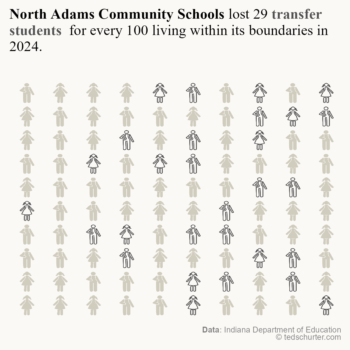
The project webpage’s explanatory section uses the Western Boone school district to illustrate how transfers work. Eight cutout icons, representing the rate of Western Boone students transferring to other public school corporations, will replace 8 regular icons in the chart. Their color will match that used for public transfers throughout the project.
Indexing within a for loop accesses the rows that were previously randomly selected and assigned to vector zz and changes the contents of the image and color columns of those rows to represent an outgoing transfer to a public school.
# assign outgoing public transfer rate to z
z <- 8

# randomly determine which rows of ls dataframe will have their icon replaced and color changed. assign the values of the rows to be replaced to zz
zz <- sample(100, abs(z), F)

# for each of the rows represented in zz, replace the full figure image with cutout image to represent outgoing transfers' absence; assign fill color to the new icons that represents public transfers.

for (a in (zz)){
  ls[a,5] <- sample(out_st, 1)
  ls[a,4] <- pub
}
Although there is no legend in this example to clarify the meaning of the colors, the context of the project webpage includes color-coded text to help readers draw connections.
ggplot(ls)+
  geom_image(
    aes(x, y, color = color, image = image))+
  scale_color_manual(values = vals)+
  theme_void()+
  theme(
    legend.position = 'none')

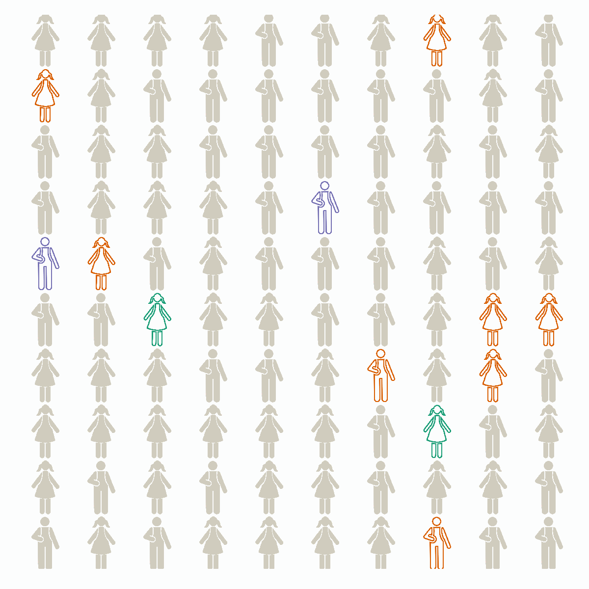
Next, icons to show the rate for outgoing transfers to charter schools, two per 100 students with legal settlement, are added. To avoid overwriting the public transfer icons added above, the new random sample locations must be drawn from the ls dataframe after it’s filtered to the remaining non-transfer students. The rest of the process is identical to the steps above.
# assign outgoing charter transfer rate to z
z <- 2

# randomly determine which of our z number of elements from our dataframe of 100 values that are still standard color icons will be replaced with charter transfer icons. assign those values to zz
zz <- sample((ls |> filter(color == lgst) |> select(row) |> pull()), abs(z), F)

# for each of the rows represented in zz, replace the full figure image with cutout image to represent outgoing transfers' absence; assign fill color to the new icons that represents charter school transfers

for (a in (zz)){
  ls[a,5] <- sample(out_st, 1)
  ls[a,4] <- chr
}
The icons for charter school transfers are added to the previously added icons for public school transfers.
ggplot(ls)+
  geom_image(
    aes(x, y, color = color, image = image))+
  scale_color_manual(values = vals)+
  theme_void()+
  theme(
    legend.position = 'none')

The process, and the transfer rate, for Choice Scholarship transfers is the same as above.
# assign outgoing Choice Scholarship transfer rate to z
z <- 2

# randomly determine which of our z number of elements from our dataframe of 100 values will be replaced with Choice Scholarship transfer icons. assign those values to zz
zz <- sample((ls |> filter(color == lgst) |> select(row) |> pull()), abs(z), F)

# for each of the rows represented in zz, replace the full figure image with cutout image to represent outgoing transfers' absence; assign fill color to the new icons that represents Choice Scholarship school transfers

for (a in (zz)){
  ls[a,5] <- sample(out_st, 1)
  ls[a,4] <- pr
}
Looking at the final chart showing total outgoing transfer rates it’s necessary to take a math detour.
To illustrate the different components that constitute the outgoing transfer rate, this example divides it into its constituent parts: public, charter and Choice Scholarship transfer rates. To avoid partial icon figures, each component of that rate is rounded to the nearest integer. The raw transfer rate for both charter and Choice Scholarship transfers in Western Boone is 1.59. They each round to 2 resulting in four adjusted outgoing transfer icons.
The sum of the raw charter and Choice Scholarship numbers, however, is 3.18 which would round to 3 icons. This difference impacts the net transfer rate. To remain visually consistent, the net transfer rate for Western Boone in the example uses 5 - the difference between the incoming and outgoing transfer rates used in the illustration. The project webpage notes the rounded figures.
The net rate chart for Western Boone used in the choropleth map, though, takes the raw net transfer rate of 5.54 and rounds it to six. It’s a small difference but one worth noting.
ggplot(ls)+
  geom_image(
    aes(x, y, color = color, image = image))+
  scale_color_manual(values = vals)+
  theme_void()+
  theme(
    legend.position = 'none')
To add incoming transfers, the default grid needs to expand first by adding rows to the dataframe.
# assign incoming transfers to z
z <- 17

# expand grid to accommodate 17 incoming transfers
ls <- rbind(ls,
            # add a row of 10 student icons filled with incoming transfer color
            data.frame(
              row = 101:110,
              x = seq(1,10),
              y = rep(11, 10),
              color = inc,
              image = sample(student, size = 10, T)),

            # add second row of 10 student icons filled with incoming transfer color
            data.frame(
              row = 111:120,
              x = seq(1,10),
              y = rep(12, 10),
              color = inc,
              image = sample(student, size = 10, T))
)

# limit dataframe to 100 rows + z number of incoming transfers
ls <- ls[1:(100+z),]
The resulting chart shows both the outgoing transfer rates for public, charter and Choice Scholarship schools, and the incoming rate of transfers from other school corporations.
 ggplot(ls)+
  geom_image(
    aes(x, y, color = color, image = image),
    size = .04)+
  scale_color_manual(values = vals)+
  theme_void()+
  theme(
    legend.position = 'none')
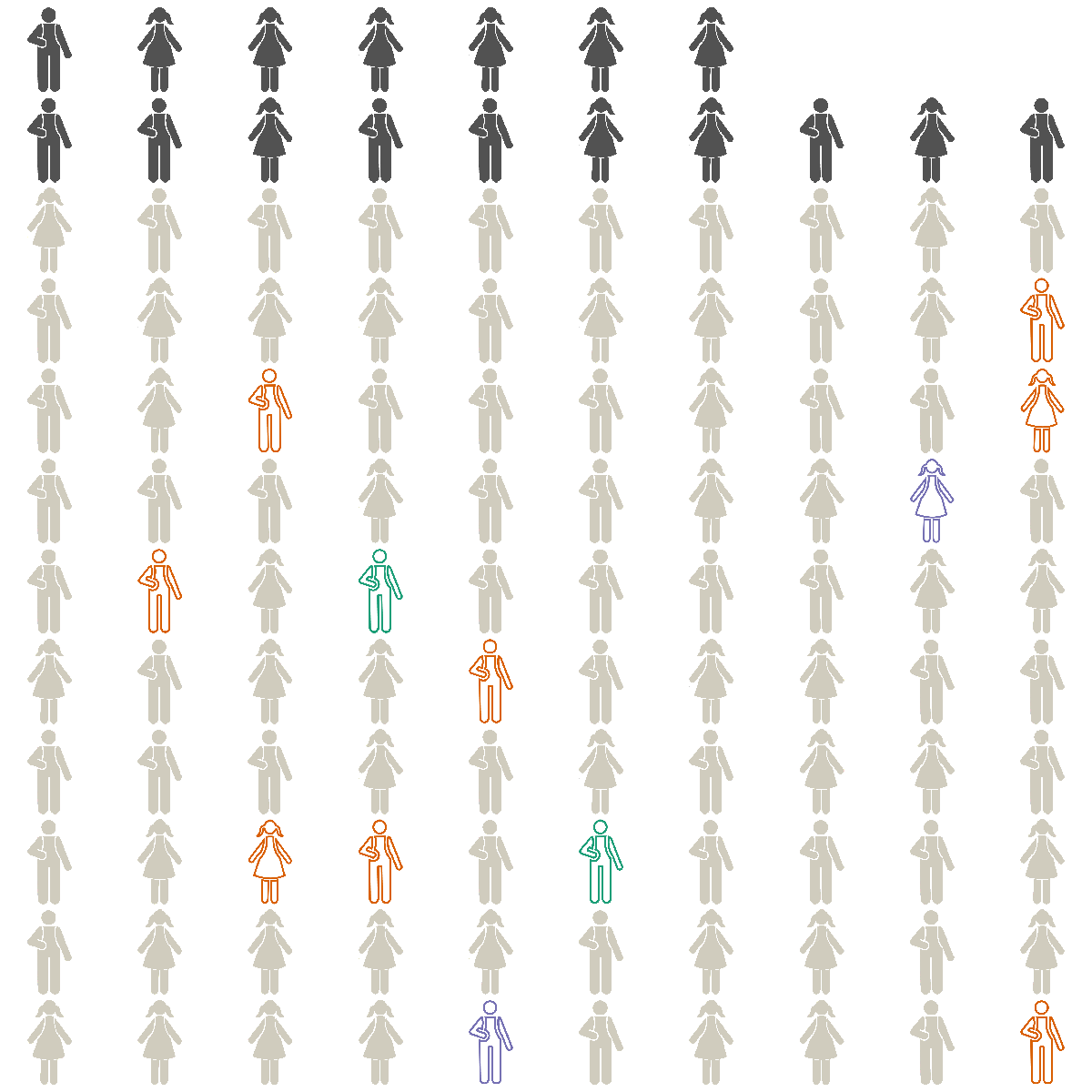
The final transfer rate is the difference between the incoming and outgoing rates. In this example, Western Boone ultimately adds five transfer students for every 100 students that have legal settlement. To create that chart we’ll revert back to the original dataframe with 100 student icons, then expand it to accommodate five incoming transfers and denote them with a different color.
# reset all legal settlement grid object ls back to no outgoing transfer icons
ls <- df

# assign net transfer rate to z
z <- 5

# add incoming transfer students to existing ls dataframe
ls <- rbind(ls,

            data.frame(row = seq(101, 110, 1),
                       x = seq(1,10),
                       y = rep(11, 10),
                       color = inc,
                       image = sample(student, size = 10, T)),

            deparse.level = 0
)

# reduce dataframe to original grid plus incoming transfers
ls <- ls[1:105,]
The final chart from this example showing a positive transfer rate can be contrasted with one showing a negative transfer rate used as a popup in the choropleth map.